
Lola
Nothing to hide.
A brand experience for LOLA built around transparency, simplicity, and trust. Spanning digital, educational guides, and supporting brand materials, the work focuses on making product and ingredient information feel approachable, easy to understand, and grounded in honesty.
Clarified ingredient transparency
Simplified complex information
Built trust through design
The Challenge
Feminine care is often marketed without clear information about ingredients or sourcing. The challenge was to present complex product details in a way that feels simple, approachable, and easy to understand.
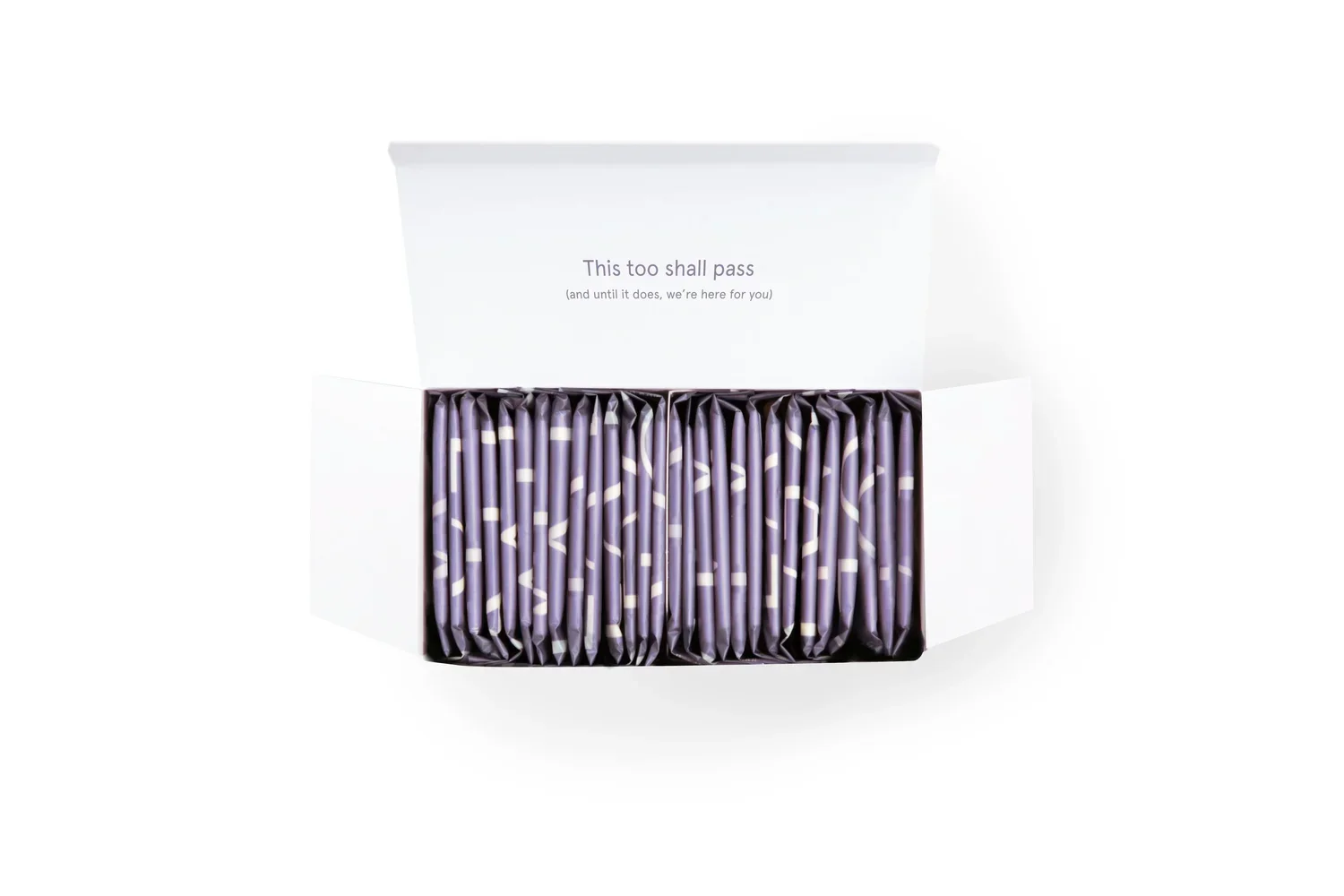
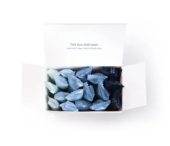
Designed to build trust.
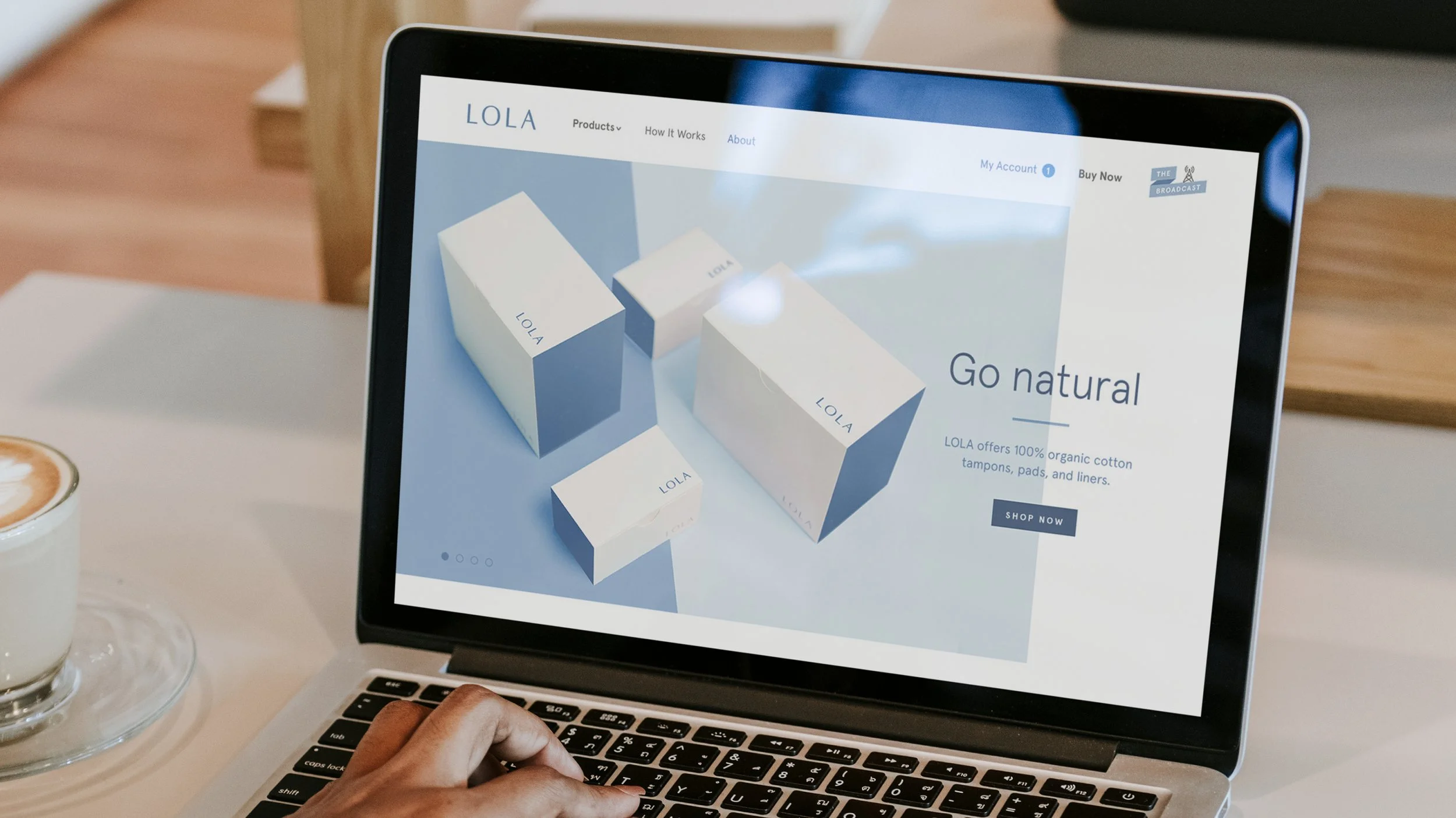
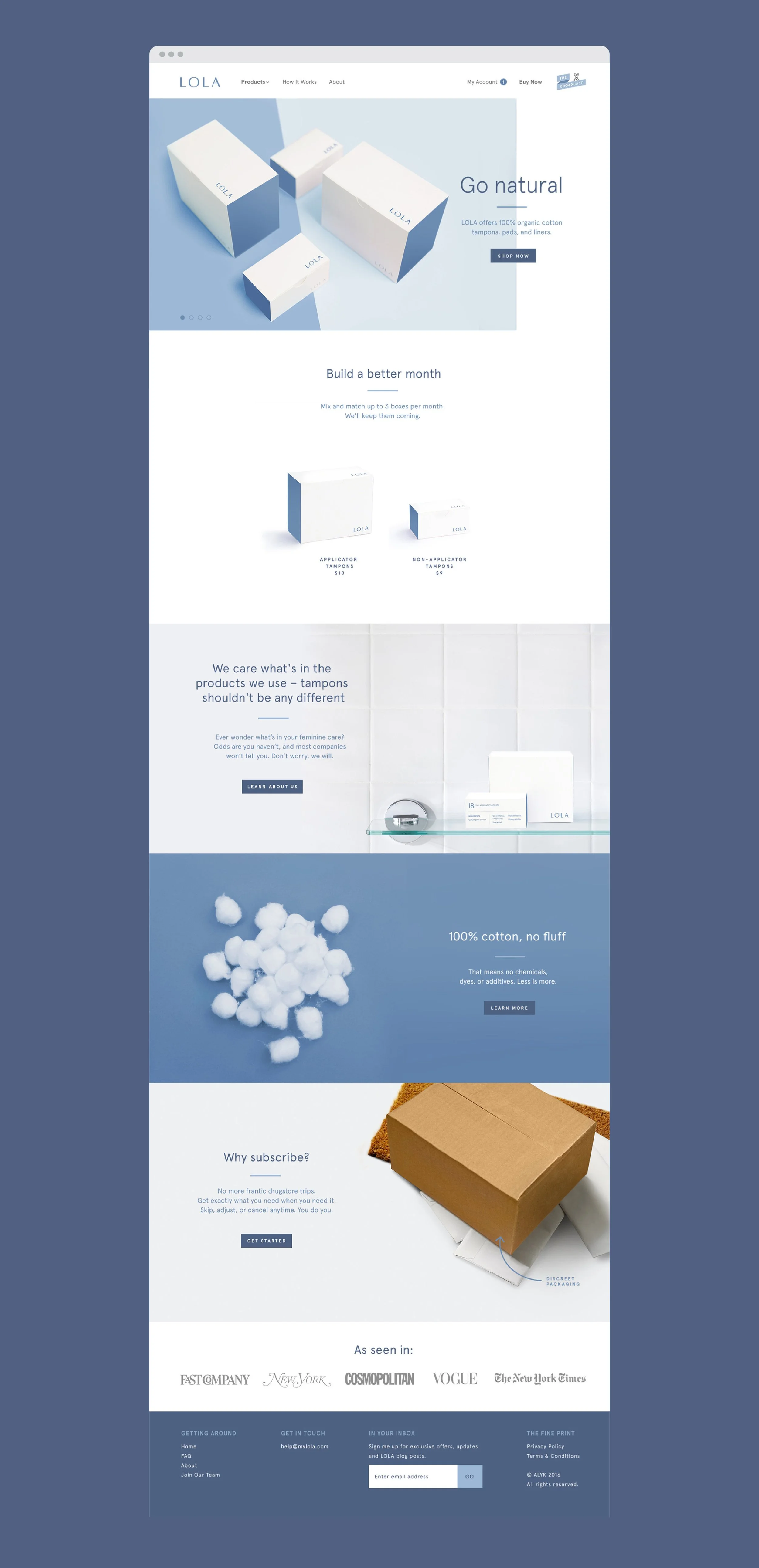
The website was designed to make product and ingredient information feel approachable and easy to understand. A minimal layout, soft color palette, and strong typographic hierarchy guide users through educational content, product details, and shopping flows without overwhelming the experience.
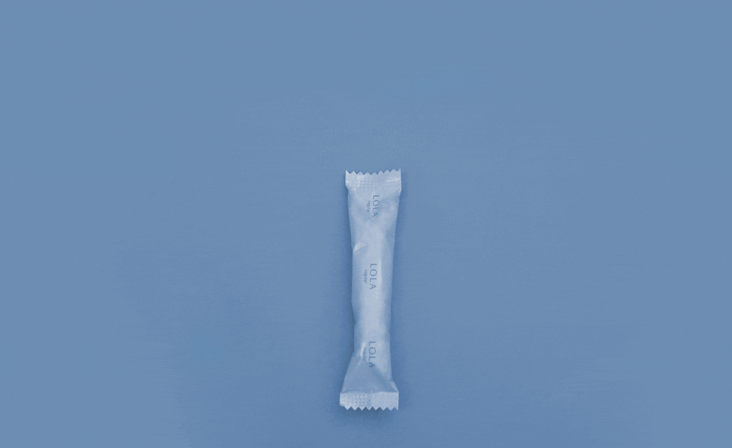
Clarity through motion.
Product animations bring transparency to life, helping users better understand what they’re using and how it works. Motion is used intentionally to support clarity, not distract from it.
Extending
the brand.
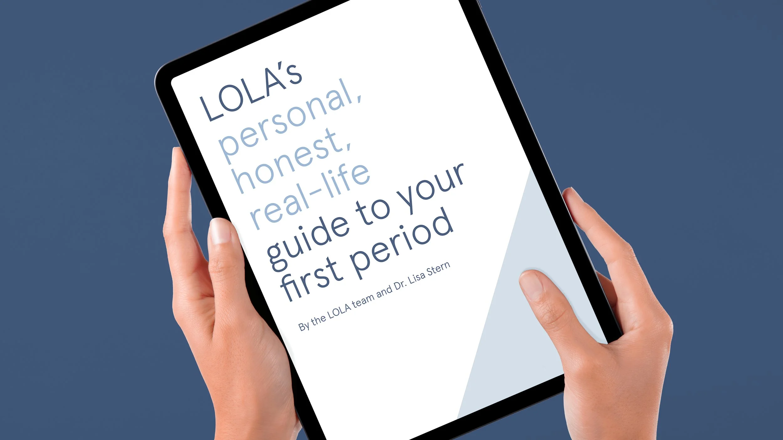
First periods, explained clearly.
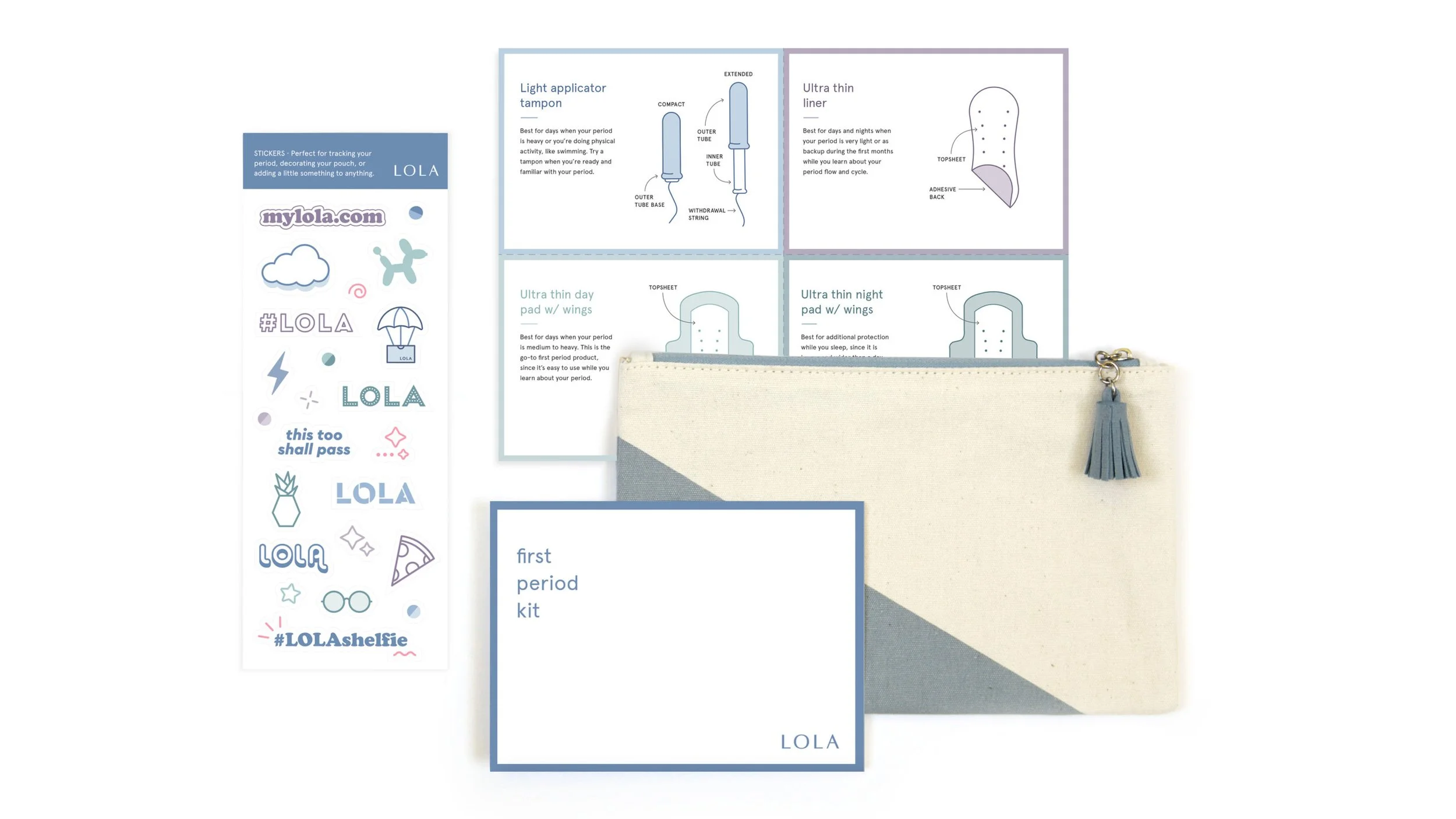
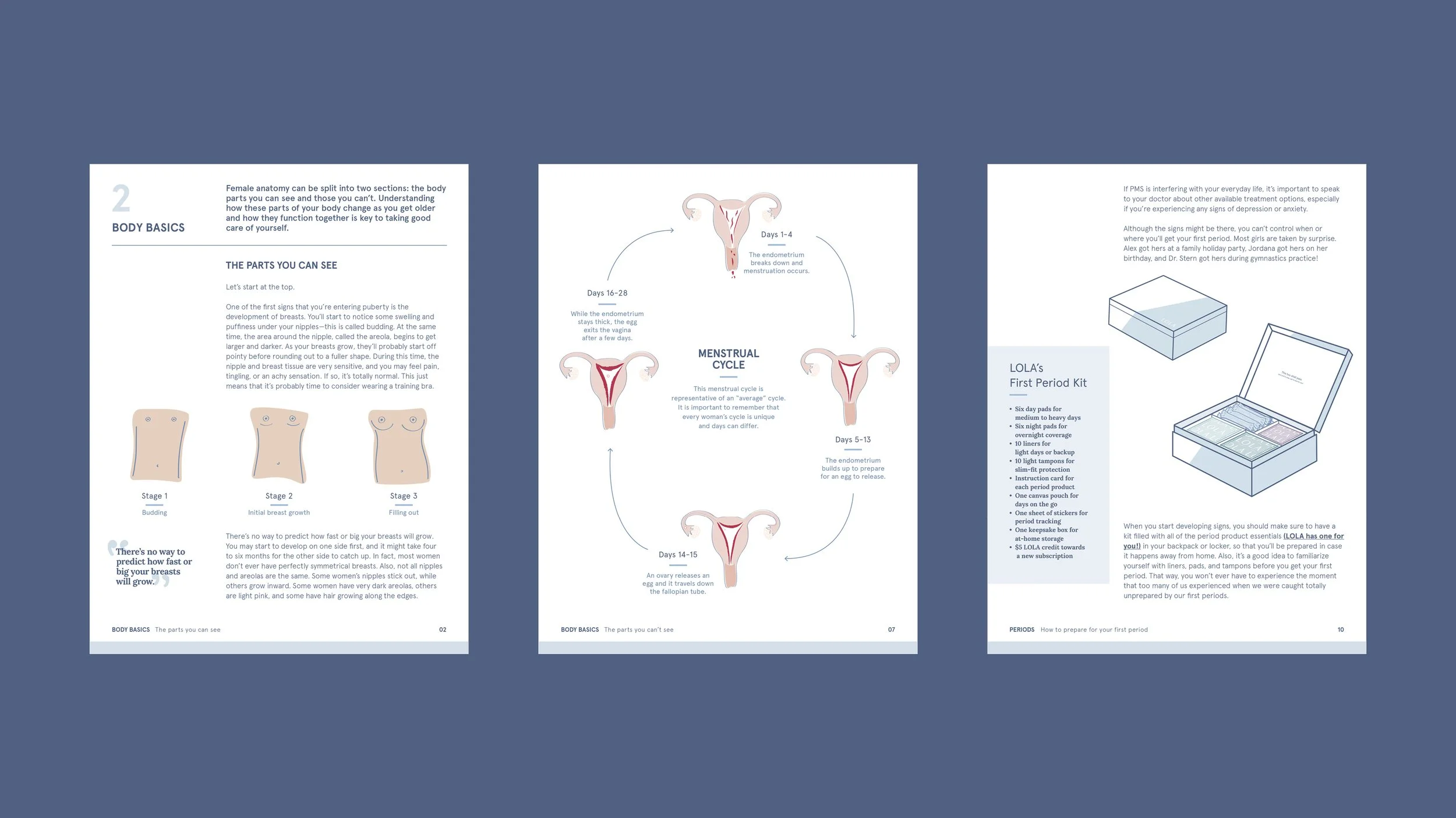
The First Period Survival Guide is a clear, easy-to-follow digital resource with detailed illustrations that help young readers understand their changing bodies, along with straightforward tips and a Q&A that answers real questions.
Keeping the brand on track.
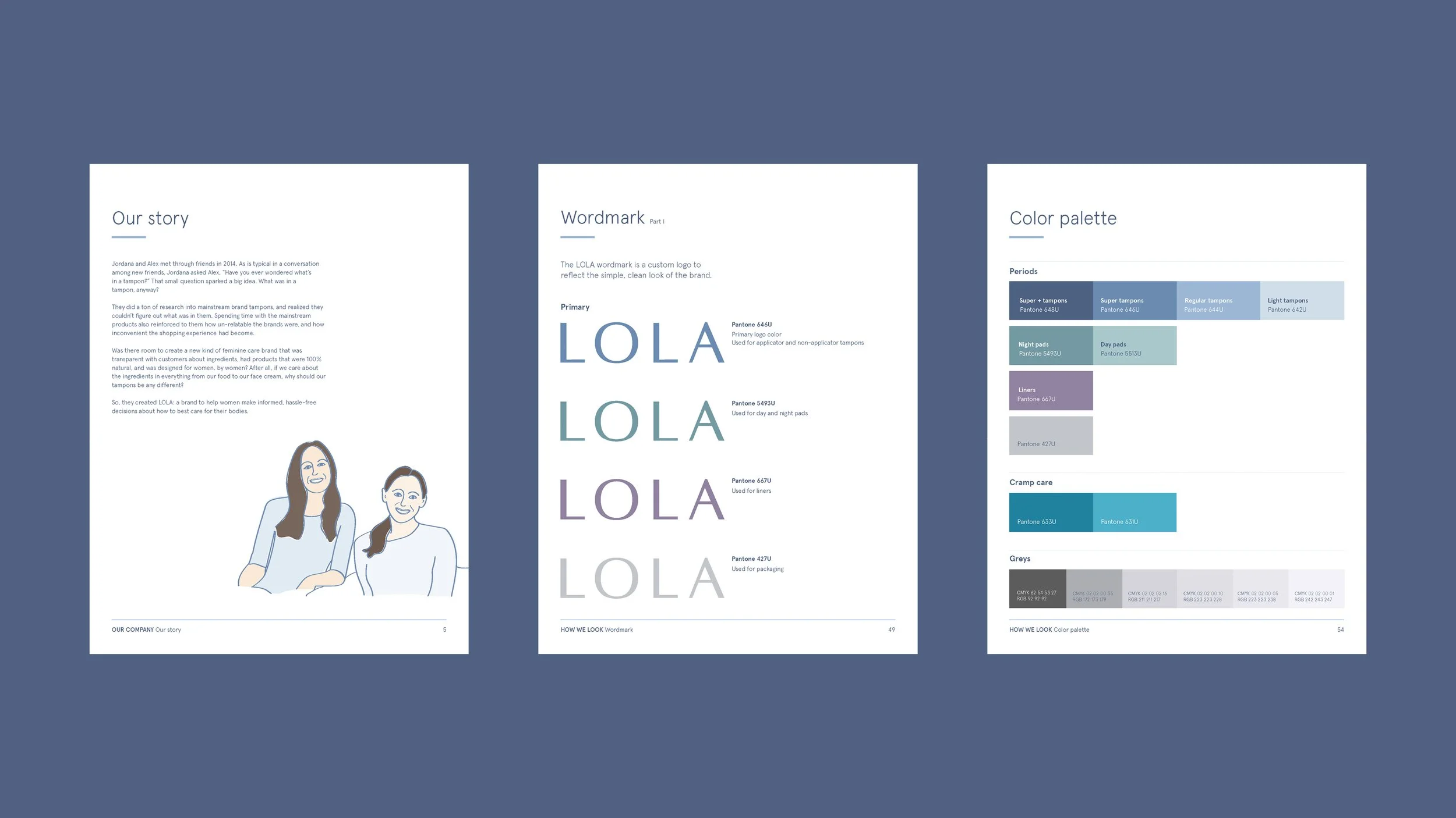
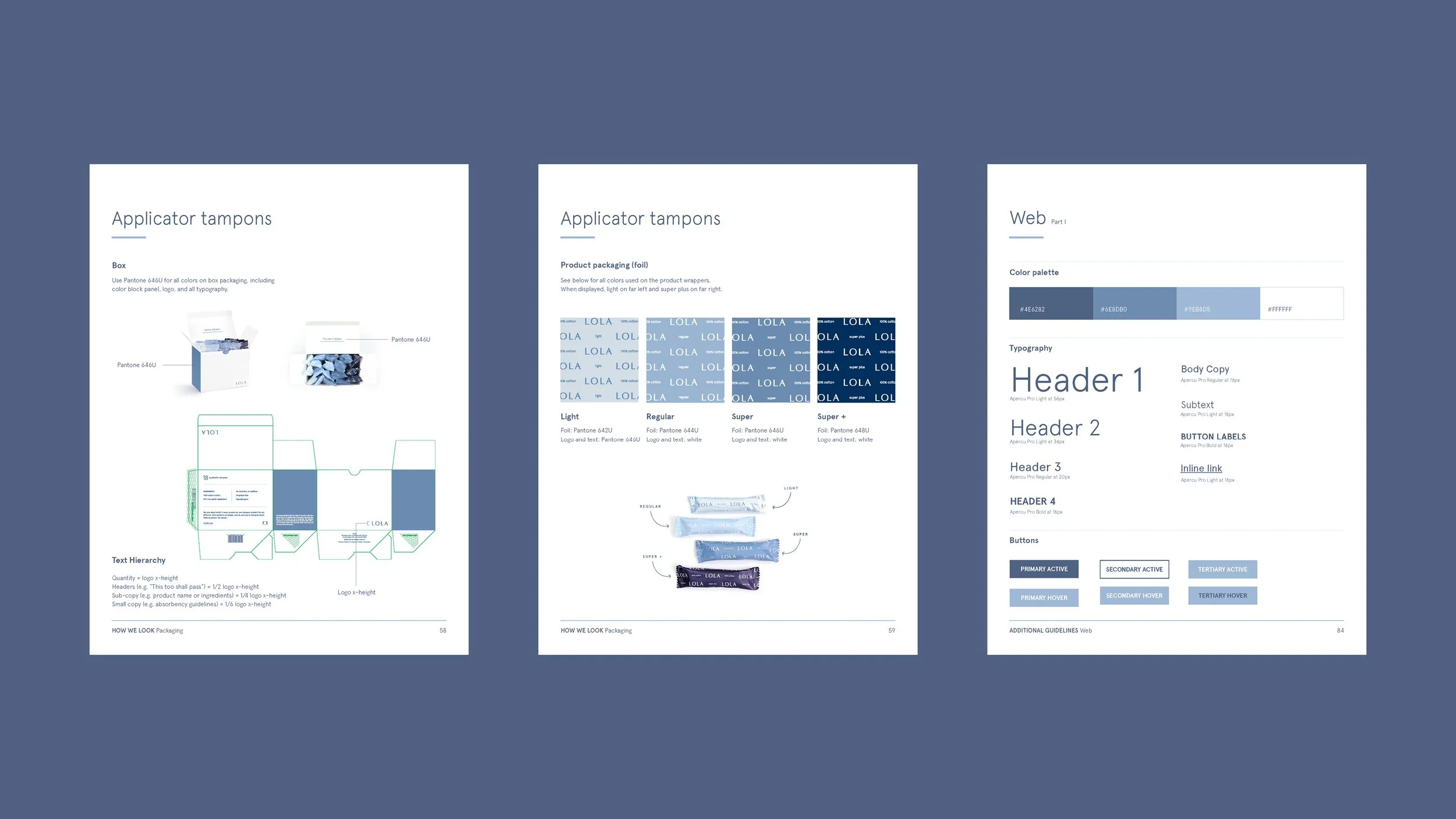
LOLA’s brand guidelines define a sleek, simple system that captures the brand’s mission and visual identity, providing clear direction for consistent and flexible use.
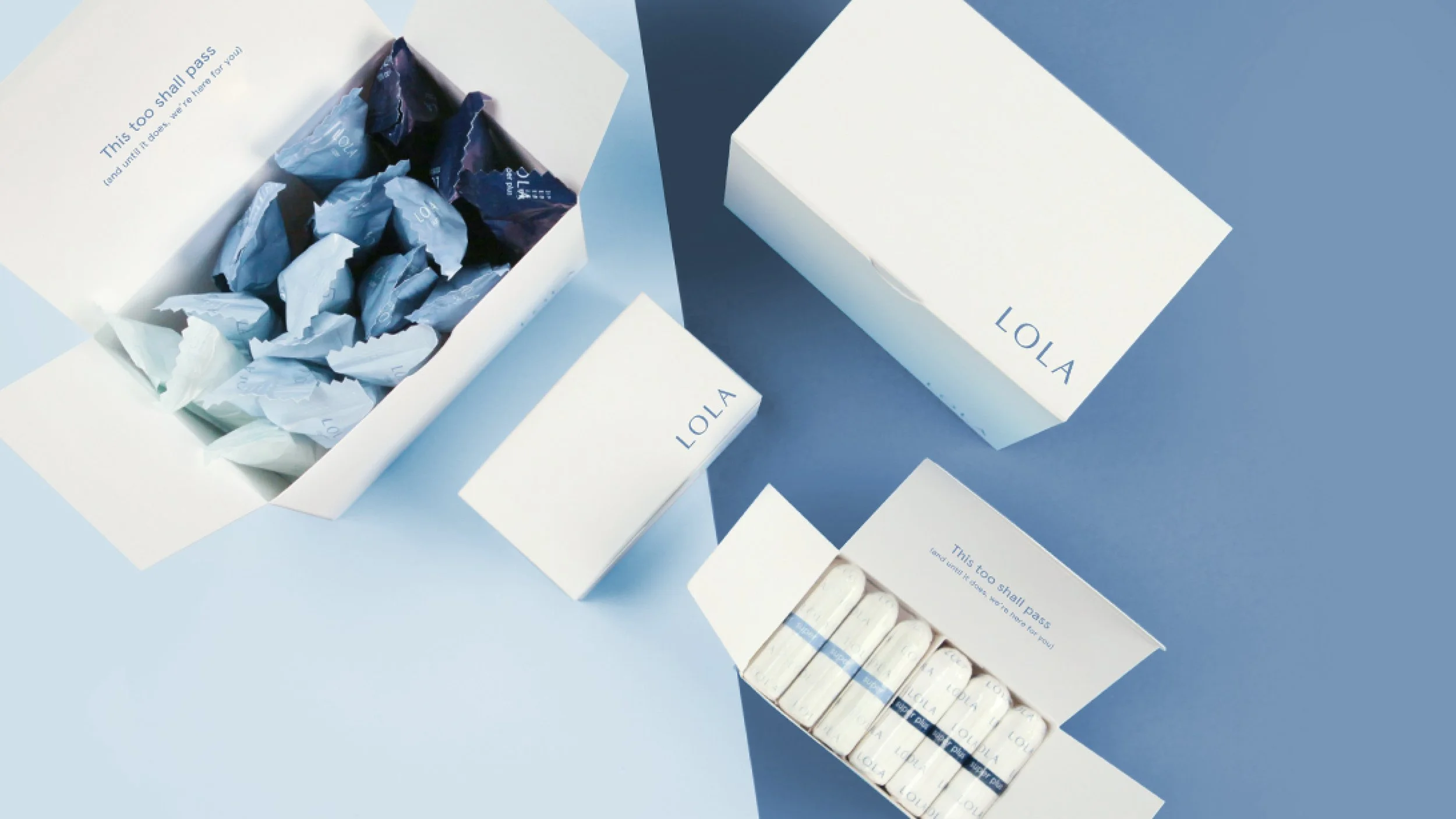
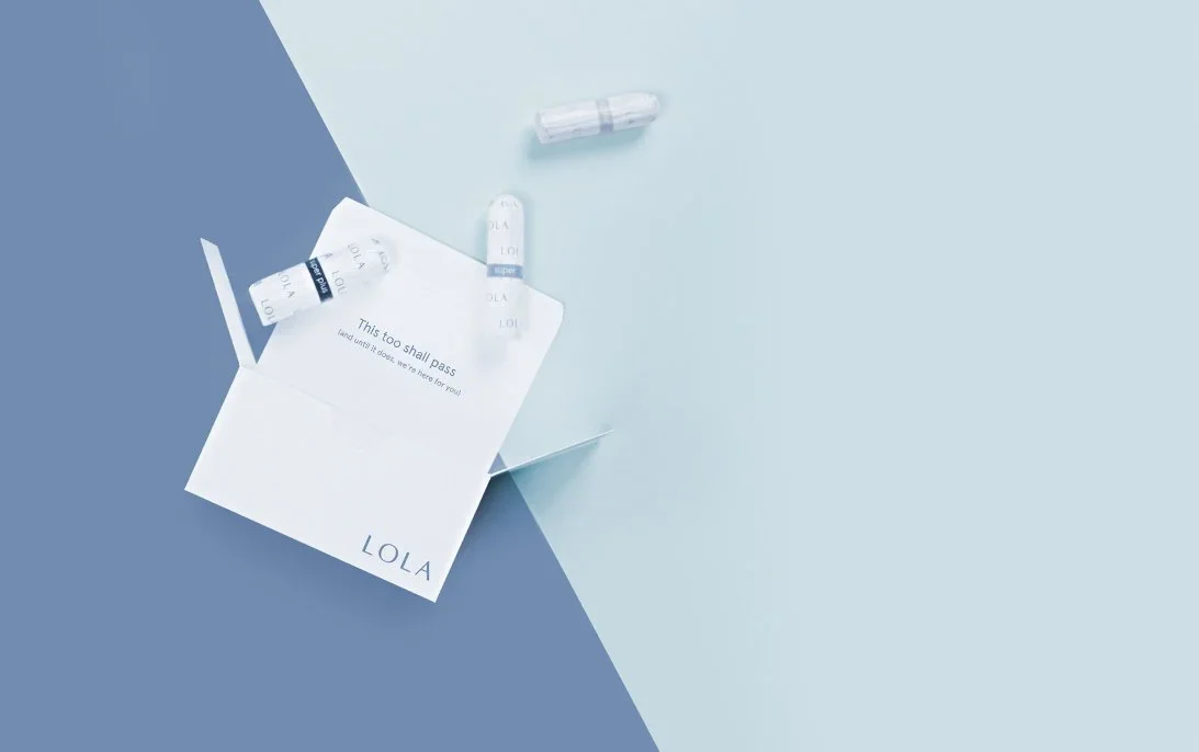
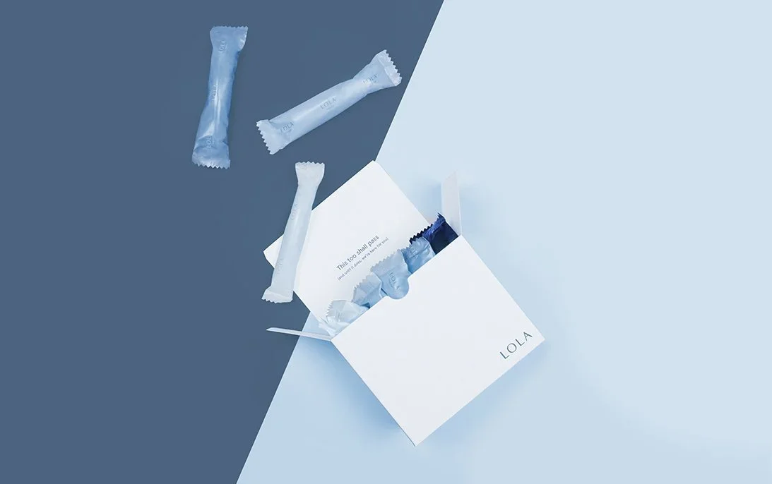
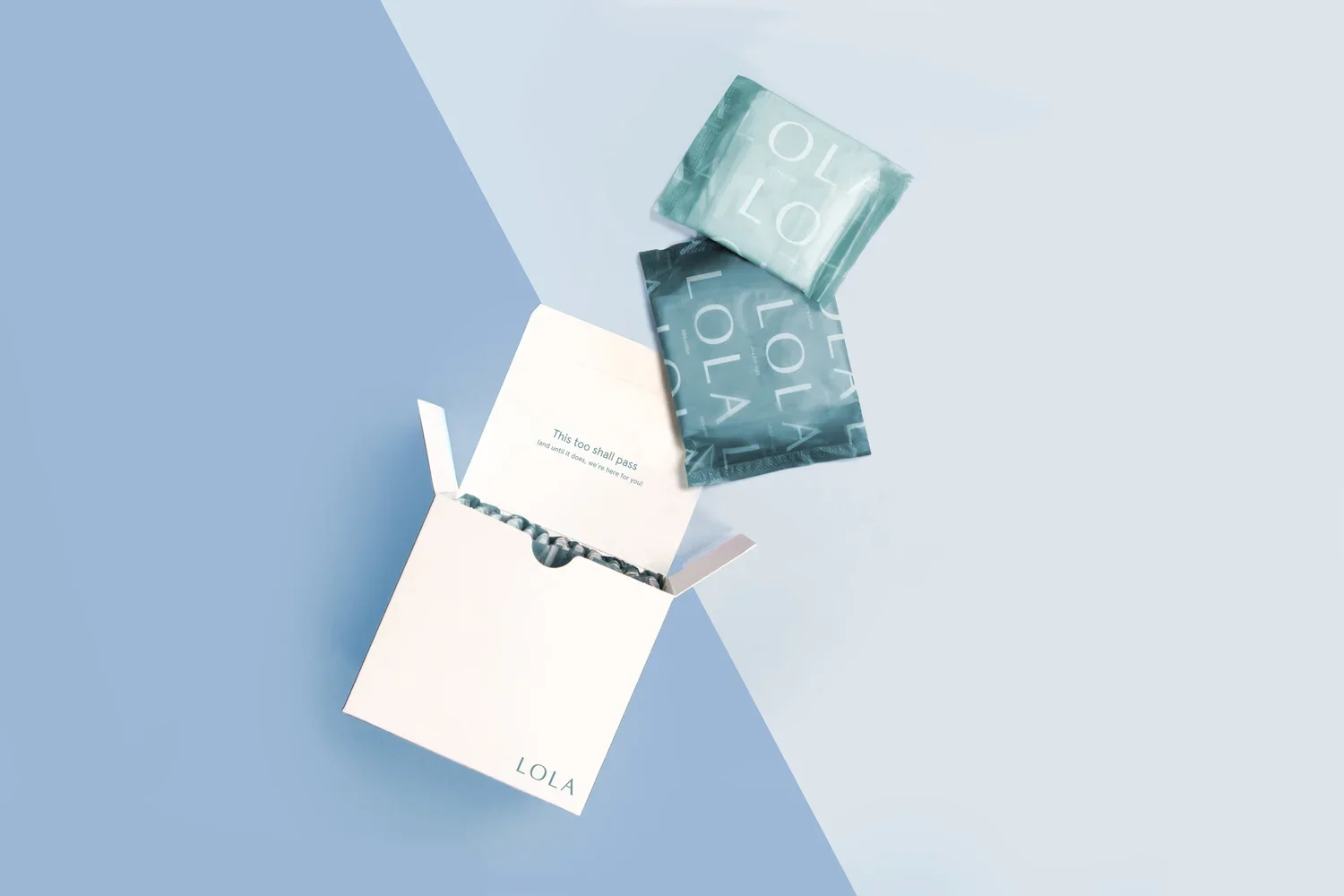
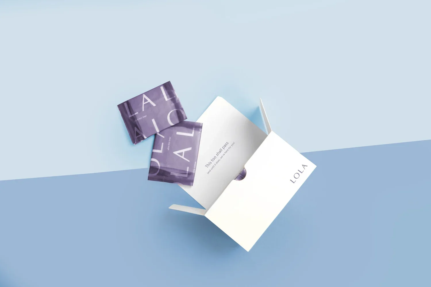
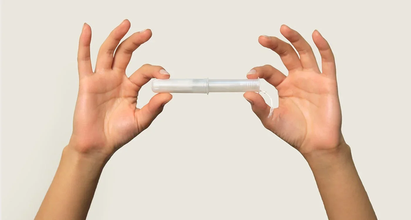
Photography
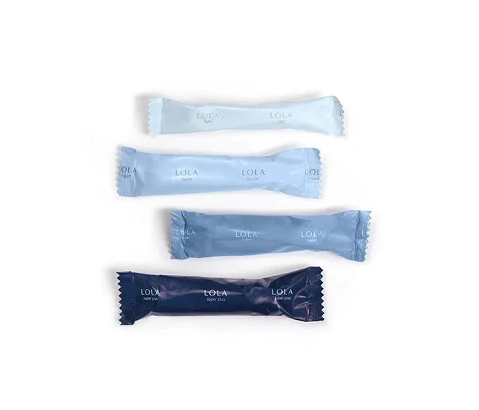
Art directed for simplicity.
Soft, natural, and minimal
Product-focused compositions
Styling that reinforces clarity and trust
The Outcome
A calm, intuitive experience that helps people understand what they’re using and why it matters. Simple, open, and thoughtfully designed, it builds trust without overcomplicating things.
Designed to make transparency feel natural.