
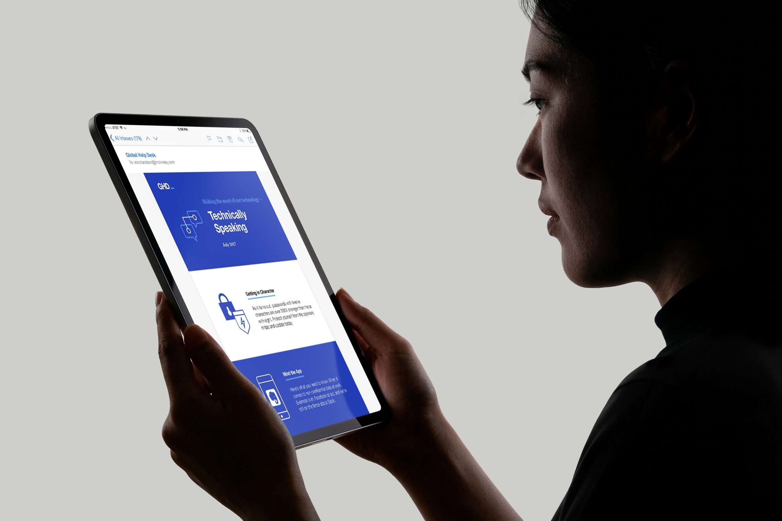
Global Help Desk
Designed to be clear.
Branding for McKinsey’s Global Help Desk (GHD), designed to make internal IT support feel clear, approachable, and easy to navigate. The system spans logo, visual identity, illustration, and digital applications, all built to simplify complex services into something intuitive and human.
Built a brand system from the ground up
Defined a clear, approachable visual language
Designed for simple, direct communication
The Challenge
Employees needed to navigate multiple support services without feeling overwhelmed. The challenge was to create a unified identity that made technical support feel approachable, consistent, and easy to use across every touchpoint.
Shaping the system.
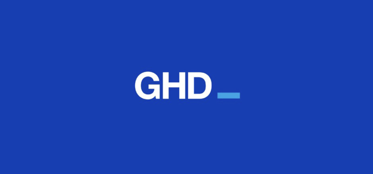
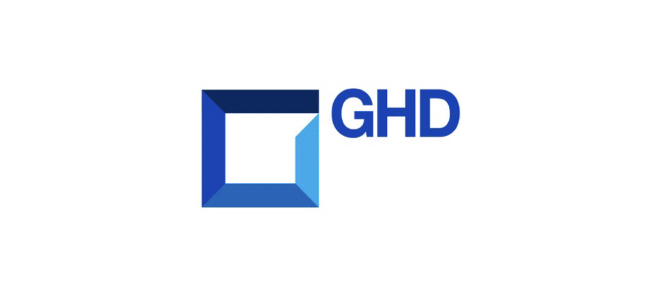
Two directions were developed to explore how the brand could balance clarity and approachability.
Direction A
A more expressive, campaign-driven approach that explored illustration, bold graphics, and conversational messaging.
Direction B
A cleaner, more scalable system focused on clarity, flexibility, and ease of use. This direction became the foundation of the final identity.
This final direction builds on the second approach, emphasizing clarity, structure, and ease of use.
A system that responds.
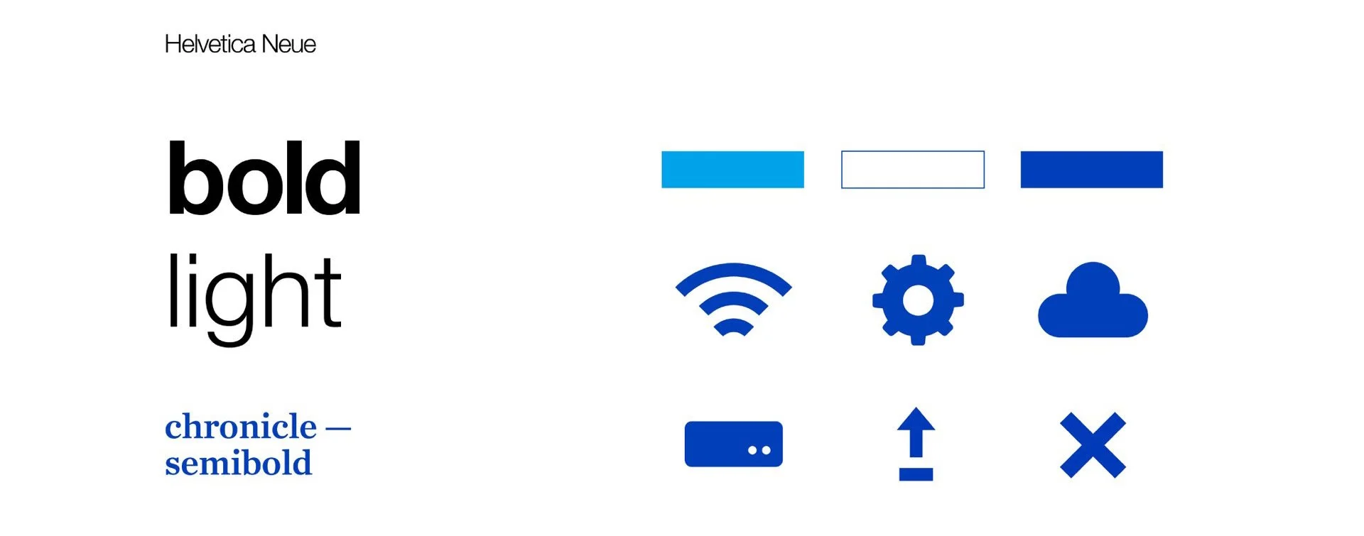
The identity is built around clarity and reduction. A minimal palette, strong typography, and generous white space create a system that prioritizes readability and ease of use, while subtle visual elements introduce warmth without adding noise.
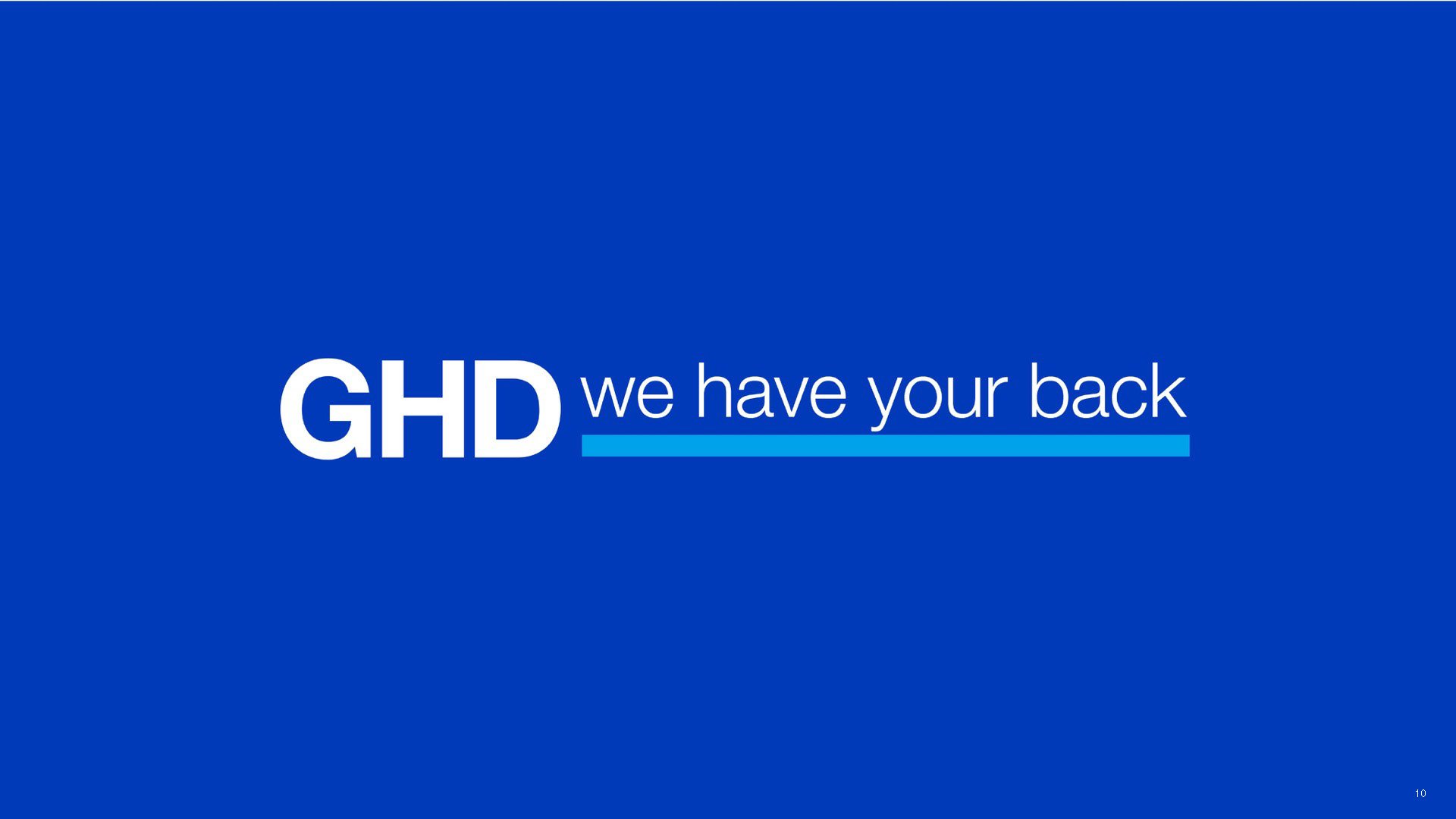
The GHD logo reinforces this approach, with a custom wordmark that balances a friendly, professional tone. The underscore acts as a prompt, signaling that support is always ready to follow.
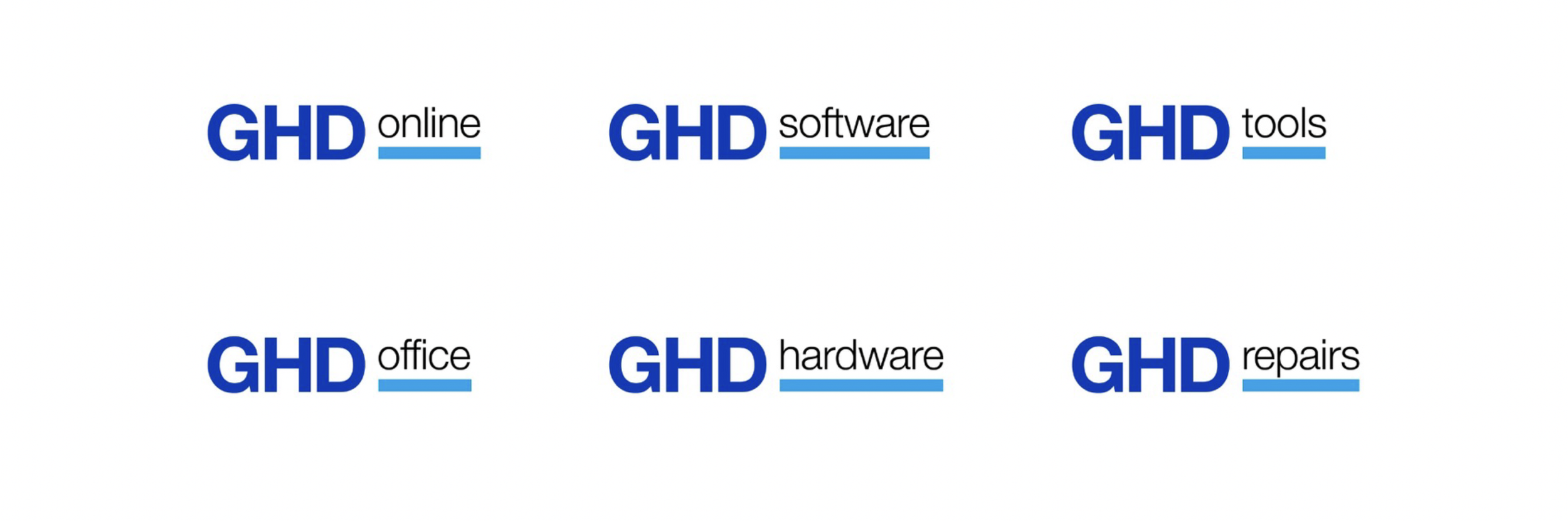
Designed
to scale.
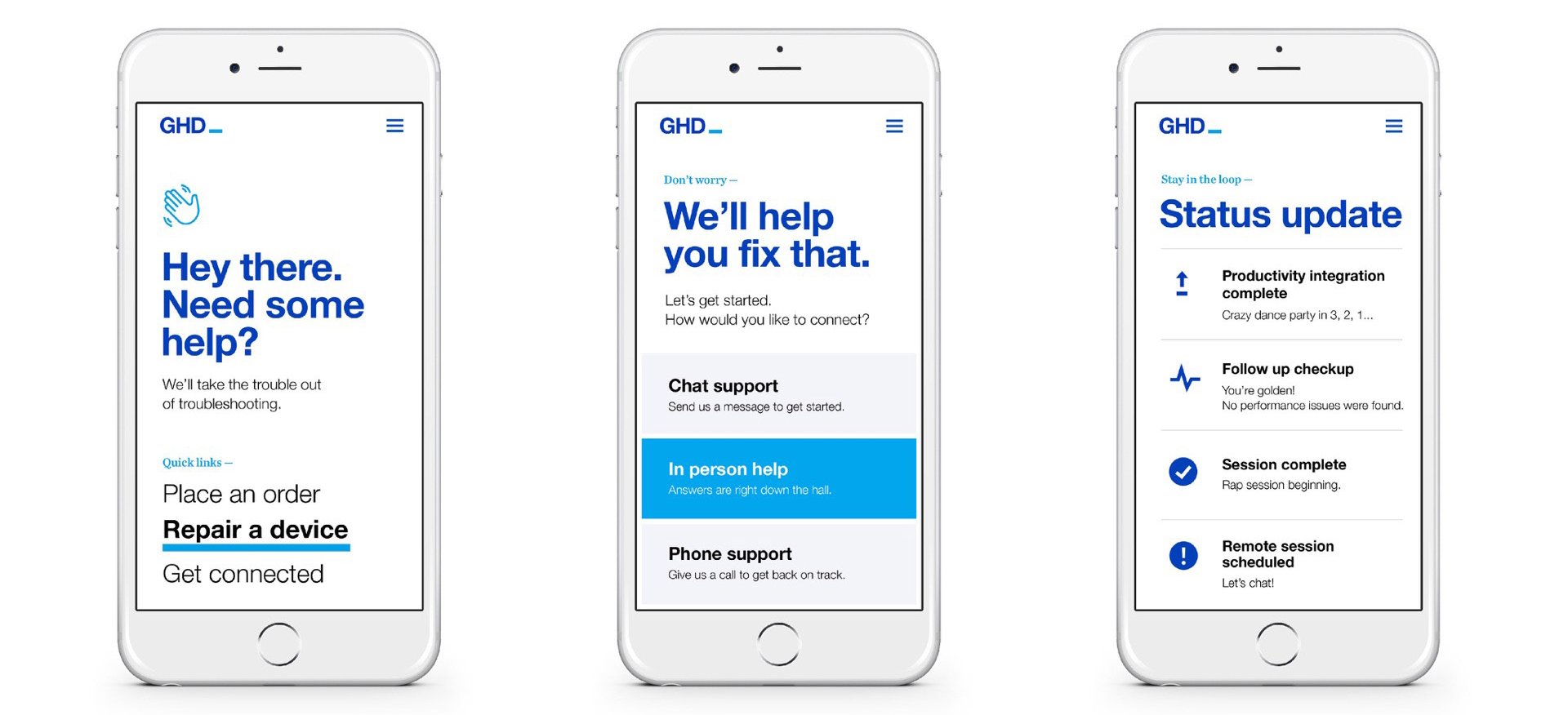
The system was designed to flex across onboarding, self-service tools, support portals, and internal communications. Consistent layouts, typography, and interaction patterns create a familiar experience no matter where employees enter the ecosystem.
In the real world.
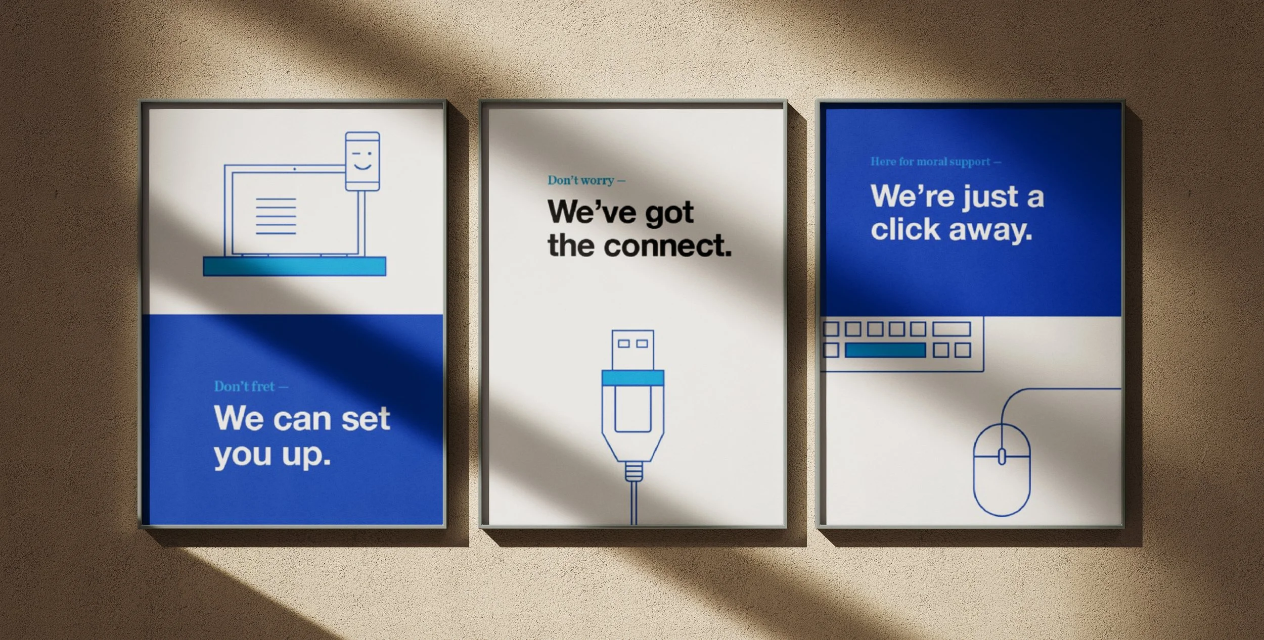
The brand comes to life across physical spaces, from reception areas to kiosks and signage. The same clarity and simplicity carry through, making it easy for people to find what they need, wherever they are.
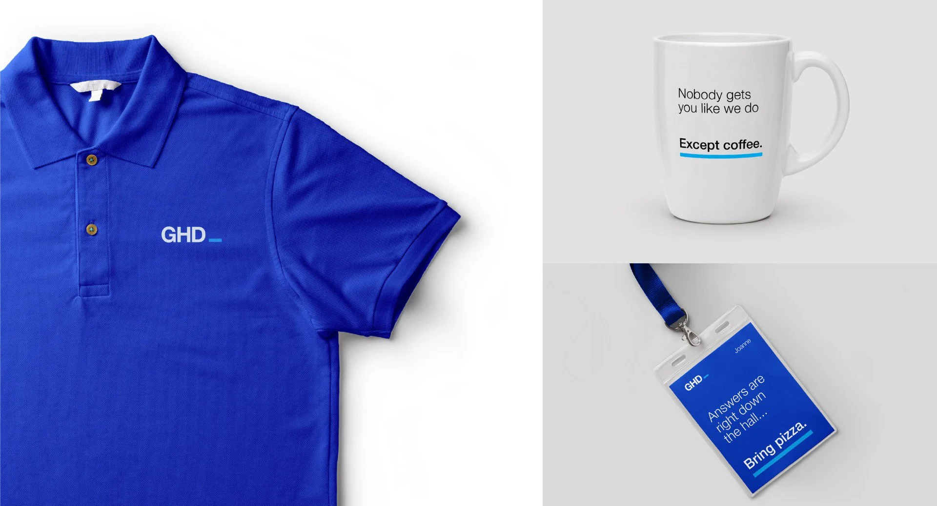
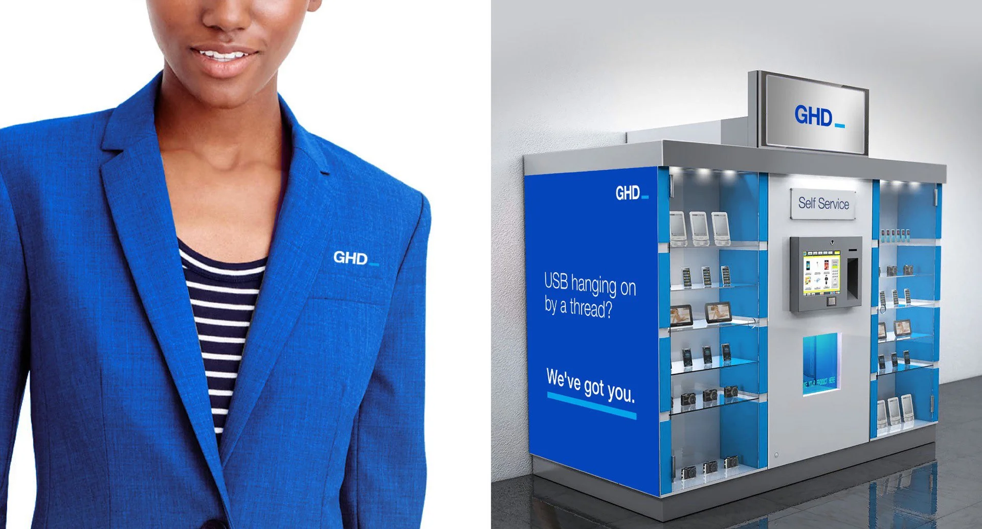
Every detail matters.
From boxes to manuals to cable labels, every element is designed to be clear and easy to navigate. Simple, direct communication helps users quickly understand what they have and how to use it.
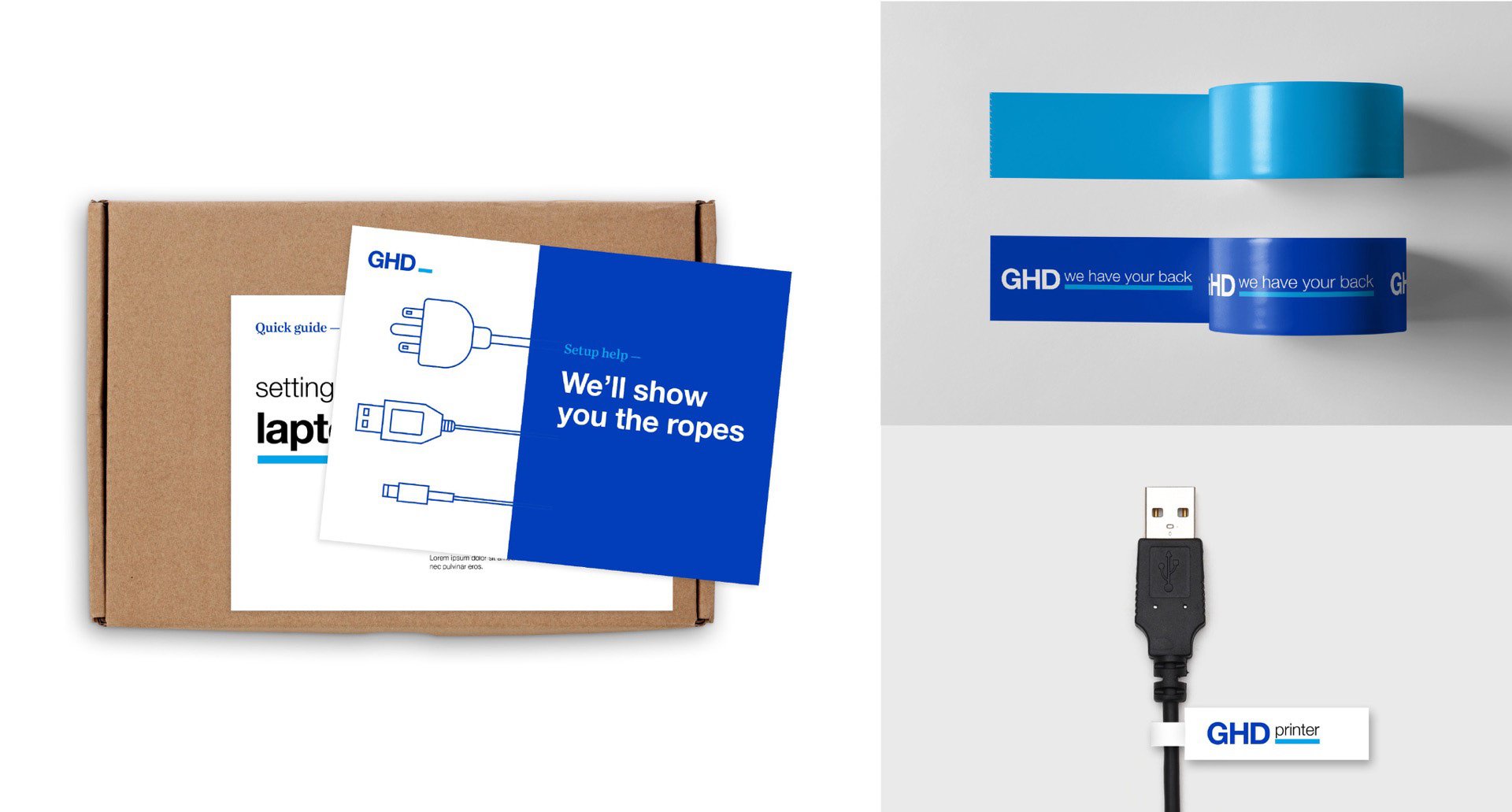
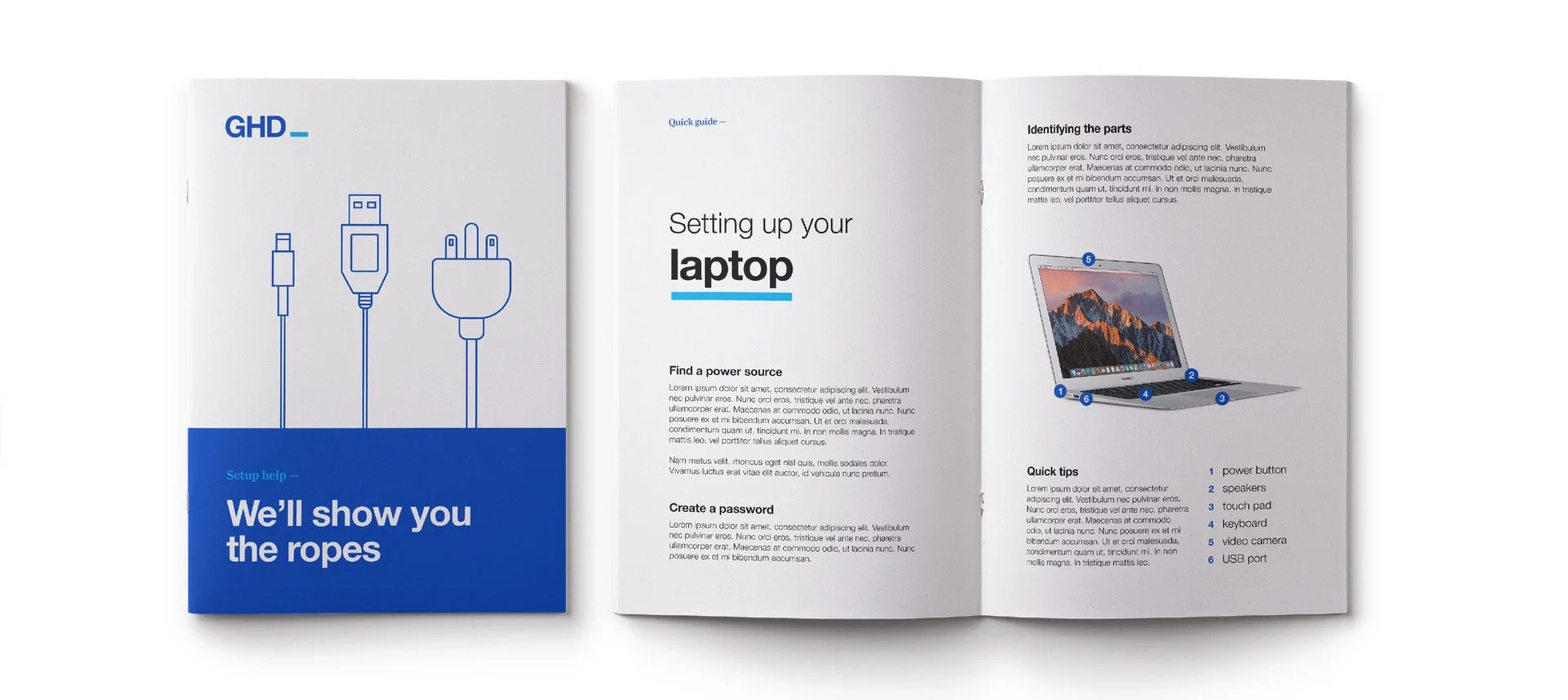
The outcome.
The result is a cohesive brand system that transforms technical support into a more approachable experience. Built to scale across digital, print, and environmental applications, the identity brings clarity and consistency to every interaction.
A system designed to get out of the way, so people can get what they need, fast.